top of page
Top
Sophia Web app
Web app that enhances the experience customers have when ordering steel products with a built-in AI


Overview
This project was completed during my internship at 247TailorSteel where I was working as the lead UX/UI Designer in the team. The design process took 6 months where the idea was that I get a better understanding of the company's users and how they experience their product called Sophia.
My role
UX/UI Design intern
Team
Timeline
Tools
Developer team
Feb 2020-July 2020
Adobe XD

Problem
Customers struggle placing orders with Sophia
The order intake process of Sophia® desktop involves several essential steps such as uploading a design of a part the customer wants to order, which is then approved or disapproved automatically by the AI. This whole process takes long because of which customers eventually give up placing their order.
Design Challenge
How might we use current functionalities as a basis to create a self explanatory web version of Sophia?
Solution
Sophia Web: A new web version of the app that helps customers efficiently place orders
Logging in and finding clear steps to place order
Users can login with their own account and upload their design files.
There are clear guidelines and feedback given whether a design is approved by the AI or not.
Clear steps are indicated with numbers to show progress with the option to go back to previous steps as well.


Finding all previous info in your personal dashboard
Users always have access to their dashboard through the side menu and can edit their account info, look into their order history and see previous uploaded (approved) design files. They can use this to continue where they left off or reorder the same part again, resulting in efficiency.
Process
Research
How did I get there?
Desk research
I started the design thinking process with desk research where I looked into articles that focused on the behaviour of AI and its affect on UX in systems. Where these were the insights I came up with:
-
Verification of proposed actions by users
Giving explanation or feedback on whatever behaviour the AI makes as a result of user action could enhance dependency on the system
-
Combining pragmatics with hedonics for a better UX
Sophia has a lack of hedonic attributes allowing users to feel less individualistic/autonomous towards it.
Market research
I followed with doing market research, looking into the competitors and their systems. I came up with Laserhub and 3D hubs being the main competitors. I focused on the features they provide that makes it fit in the market.


User interviews
I carried out 4 interviews with different types of users of Sophia, internally and external users. These points were derived:
1
Dont seem to find the guidelines
-“instead of news it could be nice to have guidelines like ‘let op’”
-“I didn’t see the guidelines in Sophia®”
The customers dont seem to find the guidelines when using Sophia and would like to see them back in the system rather having to look it up themselves.
2
Do not know the amount of steps
-“Cannot see steps and how long its going to take when placing an order’”
-“It takes too long to order one part even”
Customers dont have a progress indicator to let them know how many more steps they have to take to place an order
Can't carry out essential steps
3
-“I wish I could cancel my order’”
-“Where is the order history?”
-"I want to access my qoutations from time to time to redesign"
Want to cancel orders. reorder and have access to all of these infos to make their lives easier.
Usability test
To get a better understanding on these underlying issues mentioned in the interviews, I also carried out usability tests on the previous version of Sophia. I chose two different types of target groups, new users and an old users.
3/4 participants weren't able to find the guidelines or know whether they placed an order
Web analytics
From the usability tests carried out I looked at Google analytics of the system for two different user flows:
First time users
98.2% from 5.4K
Drop off after getting a quotation/approval on their design, users giving up to go further to order.
Returning users
53K
Drop off after going through all the pages to reach the order page.
Insights
After carrying out user research, I came up with these insights:
There is an uneven level of autonomy between the user actions and Sophia
Users do not feel individualistic when using Sophia
Sophia is non-self-explanatory, hard to follow for new users
Sophia lacks visual hierarchy to put emphasis on essential things
Personas
Based on the research, I created two personas of different target groups.


Stakeholders map
Along with the user personas, I also created a stakeholder's map to get an understanding of all the parties involved in using Sophia.

User journey
Based on one of the persona's I created a user journey looking into feeling, doing, thinking and touchpoint. This gave me a better understanding of the insights and the issues the user's encounter.

Ideation
After forming the How Might We using the insights gathered from the user research, I carried out ideation session to gather ideas that could possibly answer the HMW question. I chose methods that were affective.
Diverging
Method: Lotus Blossom

Converging
Method: Prioritizing

Design
Wireframing
The ideation session gave me a starting point to identify user flows which later were used to get an idea for the wireframes. There are three types of user flows:
1. New users


2. Returning users


3. Returning users who want to continue where they left off


Prototyping: Iterative process
After getting feedback on the wireframes from peers, I followed with HIFI prototyping. It was an iterative process where I would carry out rapid tests and improve them along the way to reach the final design.
Iterations


1
Adding clear action points
-
Users couldnt tell whether their design was approved or not. So I added clear feedback with colour green.
-
After getting feedback from the developers I decided to put the main CTA on eye level.
2
Layout of select delivery date & order summary
-
Users have long lists of orders they want to place, so I made the calendar stick on scroll to avoid having to scroll back up.
-
Similarily, on the order summary page I also placed the price info on top.

3
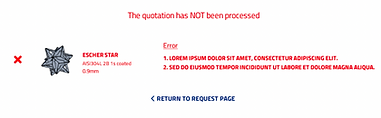
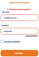
Feedback on error
-
From the tests, I added clear error points in red colour so user's get feedback whether their quotation is approved or not
-
I also added error messages on other areas like the login screen.
Usability test report
Here is the result of the usability test that I carried out

The Final Product
Reflection
I learned how to analyze different user research methods and form insights from them. Then, later use those to come up with requirements. I also learned how to follow an iterative process when prototyping and being close in contact with users to come up with the best final result. Along with that, I also got a deeper understanding of the design thinking process.
I would change is focusing more on a few elements rather than several at the same time. This could have helped me elaborate more on one main feature and problem. But due to the short time frame I was'nt able to focus as much on the solution for the guidelines feature, as I believe that was the most essential thing. I would do more research on the guidelines and based on that apply the feature more in depth in the final product.
Reflection


bottom of page